A rebrand without starting over


Floors For Everyone sells and installs flooring for homes and businesses from Davie, Florida. It is a family business. When we started working together, its brand was flat and generic, and the logo looked like it had been made in PowerPoint. The site was worse: unfinished, full of errors, with very dark colours and pixelated images. It looked like a badly assembled template.
What the client asked for
They wanted a modern site that worked and had no errors, nothing like the old one. And they wanted to modernise the logo without losing its base: they already had a lot of printed material with it. That ruled out a full rebrand from the start. The job was a different one: modernise while keeping what mattered.
What stayed and what went
The F stayed. It is the initial of Floors, and its shape recalls floor pieces fitted into one another. What went were the wood textures and other elements that did not work in the logo or in the rest of the brand.

The adjustment is simple but precise: every element that did not work was swapped for one that fitted better. Anyone who already knew the brand still recognises it, and the printed material did not go out of date overnight.
A warm palette for a family business
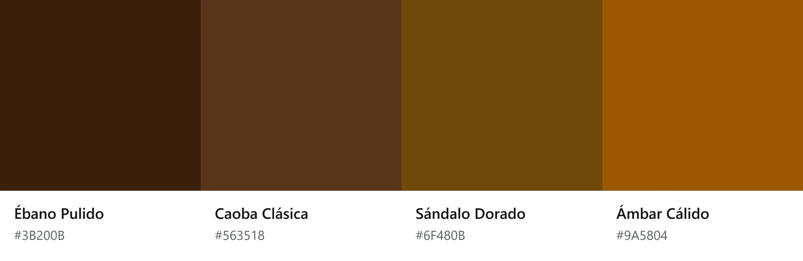
The colours come from the floors themselves, just like the shape of the F. I looked for a warm, familiar palette, because it is a family business, and ruled out any colour outside that range. Four tones remained, each with its own name:
A custom-built site
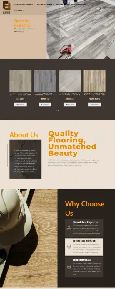
The new site is custom built in WordPress with Elementor. It is more modern, more functional and easier to use, and that changes how browsing it feels. The catalogue is organised by collection and takes fewer clicks to reach; the button to request a quote sits in the navigation and in every section.
What the client said
When they saw it, they found it spectacular, very fresh and very easy to navigate. What they valued most was reaching the catalogue in fewer clicks.
The Floors For Everyone case study sums up the site’s decisions and links to the live version.