How the Drakkar brand was born

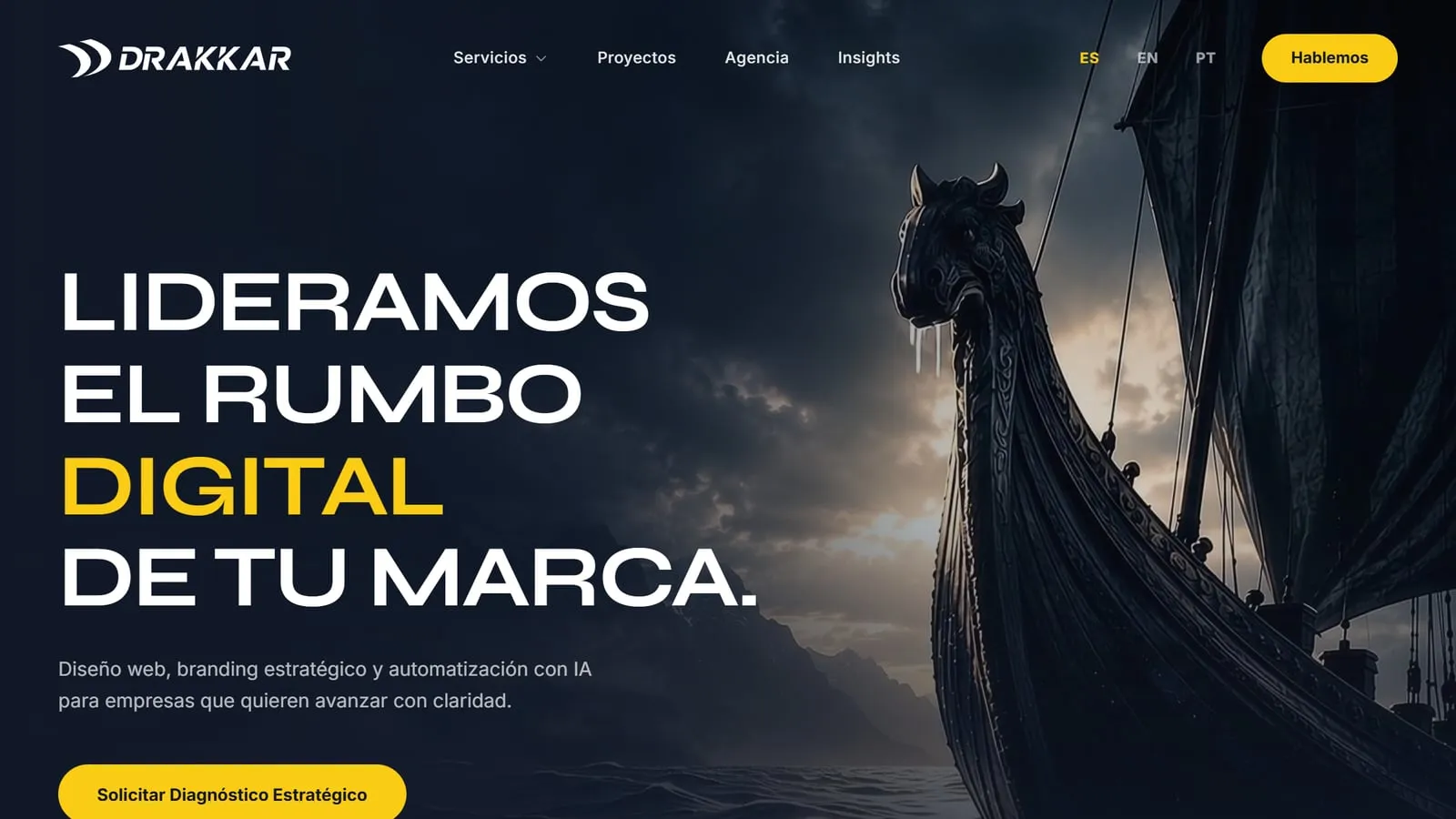
For years I worked alone, and there comes a point where doing everything wears you down and holds you back. Drakkar, the agency I run, came out of that realisation: to go far, I had to delegate. I looked for collaborators who are good at exactly what I find hardest, so I can focus on what I do best, which is building products.
A name that comes from the sea
Drakkars were the Vikings’ ships. For their time they broke the mould: they let the Vikings travel further and reach places nobody had reached, and that is how they got ahead. It is what I want for the agency’s clients.
The name was my mother’s idea. I kept it because I see myself in part of that spirit: determination, perseverance and the drive to go for more.
From a front-on ship to sails in the wind
The first logo was a ship seen from the front: three sails as vertical bars and the hull below. You got it at once, and that was the problem. It was too obvious and too rigid for an agency that wants to move fast.
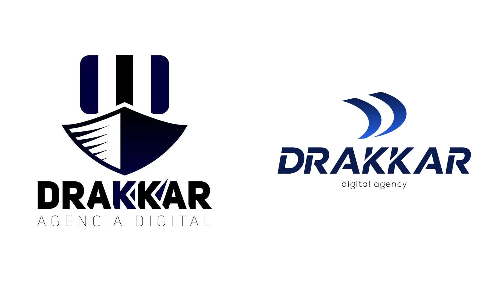
The current logo keeps the sails and sets them moving: two curved sails, filled by the wind, pushing the ship forward. The wordmark turned italic for the same reason. To present the change I made an animation in which the old ship sinks in a storm and the new brand rises from the water.
Blue for the sea, yellow for the spark
Along the way I dropped colours, such as green, that added nothing to the idea. I kept two. Blue is the sea to be crossed, and today that sea is the digital world. Yellow is the spark that guides, and that spark is each person who works at Drakkar.
Astro at home before it reaches clients
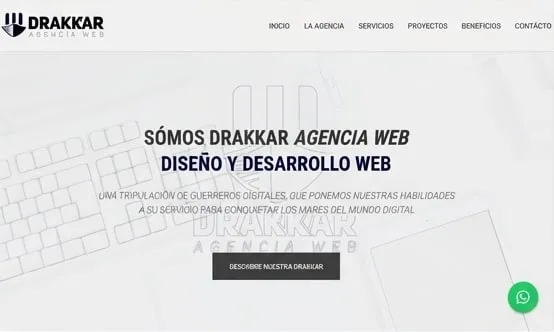
The first version of the site was white, with the front-on logo and an all-caps headline that introduced the agency as “a crew of digital warriors”.
For the current one I wanted to experiment with Astro and build something custom, closer to who we are. The agency’s own site is where it can be more technical and try a technology before taking it to client projects. Astro will not be the last.
Being your own client is harder
I am demanding and a perfectionist, and on this project there was nobody across the table. I proposed and I gave myself the feedback. With a client, the conversation moves everything along faster; here every decision came back to me, and pulling the ideas together into a brand took me longer than any commission.
Where it is heading
Drakkar is looking for clients who want to grow and reach international markets. I am redesigning the site again, more modern and closer to the movement the brand already has. When it is live, I will write about it here. Meanwhile, the Drakkar case study sums up how the current site is built.